Monday, June 20, 2011

Art Nouveau

Alphonse Mucha
http://www.abcgallery.com/M/mucha/muchabio.html


He was a prolific Moravian painter of the late 19th and early 20th Centuries and a key figure in the Art Nouveau movement. His style of painting influenced an entire generation of painters, graphic artists, draughtsmen and designers and in the minds of many, his work epitomizes the Art Nouveau. He himself came to resent his fame as an artist of the utilitarian, believing that true art should be elevated and epic.
In 1892, the painter designed his first advertising poster. Finding this line of work profitable, he began taking regular commissions and, in 1894, he designed a poster for the show " Gismonda" of the highly popular stage actress Sarah Bernhardt. The poster was revolutionary, bringing unheard of innovations to the art of poster-printing, which had hitherto consisted of large amounts of text with a few simple illustrations, usually in just one or two colors. The Gismonda poster (1892) employed a radically new vertical format -- a legacy of which we can see in posters today -- and an unheard-of amount of colors and detail. Although the painter thought of his Art Nouveau work as scarcely more than a means of earning money to enable him to pursue more serious things, critics thought differently. In 1897, the painter had his first one-man exhibition at the Galerie La Bodiniere. Later that year, a second, much larger exhibition was held at the Salon de Cent, and proceeded to tour Europe.

I know I have already done an entry on him but I have really enjoyed finding more information about him. Plus I decided that if I was going to do a whole section dedicated to art nouveau that it wouldn't be right to not add him here again. I have been looking at a few of his images and getting ideas for what I might possibly be able to use for my own projects. I really like all the patterns and all the small details that make up one poster.

Victor Horta
http://www.senses-artnouveau.com/biography.php?artist=HOR


Victor Horta was one of the leading architect and designer of Art Nouveau and his style inspired many modernist artists all over Europe. He also influenced the aesthetic ideals the avant-garde group of artists in Belgium, such as "Les Vingt" and "La Libre Esthétique". After studying drawing, textiles and architecture at the Fine Arts Academy in Gent, he established his own practice in Brussels and in 1893 he built the first Art Nouveau building, Tassel House. In the late 1890s, he was commissioned by the Belgian Socialist movement to build the Maison du Peuple. In 1898, he built his own house and workshop, now the famous Horta Museum. Inspired by nature, his style was swirling and linear, like the stems of plants. Tending towards unity, every material, surface, ornament, inside or outside, was harmoniously assembled with great fluidity and highly detailed by innovative shapes and lines. The houses are especially significant for their interior architecture: the irregularly shaped rooms open freely onto one another at different levels; the natural design of an iron balustrade is echoed in the curving decorative motifs of the mosaic floors or plaster walls.

I really like the fact that art nouveau is not just about posters, but can be seen every where you look. I didn't even think about the fact that there are a lot buildings that can be categorized in this movement. After I looked at some of the buildings that he inspired I noticed that I am drawn to them. In fact some of my furniture in my room looks like it has been inspired by such things as his door knob above. I guess its true that you cant help but to be drawn to the things that you like.


Louis Comfort Tiffany
http://www.senses-artnouveau.com/biography.php?artist=TIF


1882 he began designing glasswork of remarkable beauty in typical Art Nouveau Style. In 1902, he became art director of his father's legendary company, Tiffany & Co. in New York. He designed for the firm colored glass table lamps and lampshades, which were made in more than one edition. It was Thomas Edison who urged him to focus on electric light production after their collaboration on the design of the first Moving Picture Theater. Tiffany also designed and produced glass vases, tiles, mosaics and stained-glass-windows. In 1895, his glassware was exhibited in Samuel Bing's Gallery "L'Art Nouveau" in Paris. Tiffany wanted to elevate decorative arts to the level of fine arts, available to a wide audience. His work was influenced by Japanese and Northern-Africa aesthetics and colors; the pieces he produced between the 1890s and 1918 were magnificent, exotic and of the highest quality. His unique style became a driving force behind the emergent Art Nouveau Style. His jewel-like Tiffany lamps feature decorations inspired by organic naturalistic themes, such as flowers, butterflies or dragonflies amongst foliage. The shades are made in multi-colored, iridescent glass, set in leaded framework and their beautifully crafted bronze bases, are often decorated by tree-like motifs, or by incorporated tilework or mosaic work.

I had never thought about Tiffany lamps as part of the movement. However after looking up the lamps and stain glass panes that they use to make it is clear that they were very much apart of the movement. What I think is cool is that he made the art not just something that you hung up on your walls but something that became apart of every day life, such as a table lamp. The other part of these lamps and jewels that just makes it all more fascinating is the fact that they are so widely known and I don't know anyone that doesn't like them.

Margaret Macdonald
http://www.antique-marks.com/art-nouveau-artists.html

 Margaret and her sister, Frances MacDonald, enrolled as students at the Glasgow School of Art. There she worked in a variety of media, including metalwork, embroiery, and textiles. She was first a collaborator with her sister, and later with her husband, thearchitect and designerCharles Rennie Mackintosh. Together with Mackintosh, her sister, Frances, and Charles's friend Herbert MacNair (who married Frances in 1899), formed the group known as 'The Four', who worked in close association and were pioneers of the so-called Glasgow Style. Her watercolours were influential in Mackintosh's own creative development, and she collaborated with him on many of his decorative and architectural projects. After her marriage Margaret Macdonald's work changed and she began to concentrate on decorative gesso panels.

Though I am not as big of a fan of her work I can see how she can be categorized in the art nouveau movement. I think that she was more concentrated on the line movement of the style and the fluid movement of the nature that is present in other works. The one part that I didn't like was that she didn't have as much detail and the figures were not as pronounced or detailed.


Jules Cheret
http://www.visual-arts-cork.com/famous-artists/jules-cheret.htm


He was the first artist to make his reputation in the medium of poster art. An apprentice lithographer who went on to develop a cheaper type of colour lithography and, in the process, the lithographic advertising poster. Moreover, he enhanced the aesthetic nature of the poster, endowing it with graceful designs and transforming it into an independent decorative art form. Known as the "father of the Belle Epoque poster", he inspired other painters to explore the genre, and later produced a special book entitled Masters of the Poster, to promote the best designers. A key figure in the history of poster art, Cheret produced more than 1,000 posters, beginning with his 1867 advertisement for Sarah Bernardt, and in 1889 he received a major solo exhibition and a gold medal at the International Exhibition in Paris. He was awarded the Legion d'Honneur in 1890, and in 1928 the French government honoured his achievements in graphic art with the opening of the Cheret Museum in Nice.

It was easy to see that he was producing posters during the art nouveau movement. I would defiantly say that it is a bit more modern than the above artist. I can see why he would have a major influence in poster art though. The above image defiantly looks like something that would catch your eye and draw you in. Which is good specially if you are trying to sell some product.

Gustave Klimt


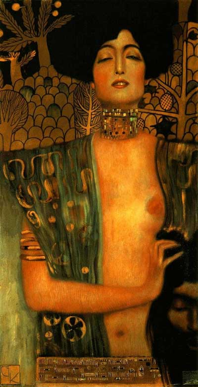
Gustav Klimt was an Austrian Symbolist painter and one of the most prominent members of the Vienna Secession movement. Klimt's primary subject was the female body, whether formal portraits or indolent nudes invariably display highly sensitized eroticism of the fin de siècle elegance. Art historians note an eclectic range of influences contributing to Klimt's distinct style, including Egyptian, Minoan, Classical Greek, and Byzantine inspirations. Gustav was enrolled, at 14, in the Vienna School of Arts and Crafts, and received training as an architectural decorator. Hebegan his professional career painting interior murals in large public buildings on the Ringstraße. In 1888 he received the Golden order of Merit from Emperor Franz Josef I of Austria for his contributions to art. He also became an honorary member of the University of Munich and the University of Vienna. Gustav Klimt's style is highly ornamental. The Art Nouveau movement favored organic lines and contours. Klimt used a lot of gold and silver colors in his art work - certainly an heritage from his father's profession as a gold and silver engraver.

What I liked most is the fact that his work has a photo quality to it. However I am not as much of a fan of his style in the background, you can clearly see that he is looking at nature for his inspiration like other but he has simplified it and has not made it realistic. Some of his stuff is a little more on the dark side, like the above image. The woman appears to be holding a male head. Did she kill him? I think what would have made it feel more art nouveau to me is if it had some borders and maybe some more pattern or nature like movement to them. However this is the difference in the areas that they were done. The images will be different when they are being done in different parts of the world.

Daniela Uhlig

I could not find any information about this graphic designer other than the fact that she works for a small company doing designs and illustrations. However when you view her website she has a wide range of image to look at. I really like her stuff, you can tell that some of them she was looking at someones work and others she has her own style to them. The above image is one in which I really like since I am thinking of doing something similar to her work. I think she did a good job of capturing the movement of the figure and then adding a background that has some pattern and nice detail. I also love the border and the circle. I hope that I can get my work to come out looking like this. 


Eden Celeste
http://www.edenceleste.com/

She has painted portraits ever since she could get a brush in her hands. For most of her career her art has focused on fantasy and sci-fi , but within the last decade she has grown to discover that er real talent and desire is in portrait art. She has a broad range of portrait interests, from the traditional style of the old masters to more of a whimisical mixture of traditional and fantasy art. For the most part she has focused on the human form, but recently she discovered that some objects also have a personality and interest as well.
Her latest series, which she calls "Artist's Cellar" is based upon her love of good wines. Each one uses a mixture of mediums including canvas or box laminated with multi-colored paper and a bottle of a favorite wine and glass painted upon it. They are sized mostly at 8"x16", which she has found to be a perfect size to display in a kitchen, dining rom or other household spot where you would typically enjoy a nice glass of vino.

There was not much info on this artist but again I can tell that she has looked at the style. However she says that she loves wines, I would have exspected there to be a lot more vine work and maybe some more stylized movement around the figure.

Toulouse Lautrec
http://www.ibiblio.org/wm/paint/auth/toulouse-lautrec/
http://www.notablebiographies.com/St-Tr/Toulouse-Lautrec-Henri-de.html


In 1882, encouraged by his first teachers—the animal painters René Princeteau and John Lewis Brown—Toulouse-Lautrec decided to devote himself to painting, and that year he left for Paris. Enrolling at the École des Beaux-Arts, he entered the studio of Fernand Cormon. In 1884 Toulouse-Lautrec settled in Montmartre, an area in north Paris, where he stayed from then on, except for short visits to Spain,
where he admired the works of El Greco (1541–1614) and Diego Velázquez (1599–1660). In England he visited celebrated writer Oscar Wilde (1854–1900) and painter James McNeill Whistler (1834–1903). At one point Toulouse-Lautrec lived near painter Edgar Degas (1834–1917), whom he valued above all other contemporary artists (artists from his time) and by whom he was influenced. From 1887 his studio was on the rue Caulaincourt next to the Goupil printshop, where he could see examples of the Japanese prints of which he was so fond. The two most direct influences on Toulouse-Lautrec's art were the Japanese print, as seen in his slanted angles and flattened forms, and Degas, from whom he derived the tilted perspective, cutting of figures, and use of a railing to separate the spectator from the painted scene, as in At the Moulin Rouge. But the genuine feel of a world of wickedness and the harsh, artificial colors used to create it were Toulouse-Lautrec's own. Toulouse-Lautrec broadened the range of lithography (the process of printing on metal) by treating the tone more freely. His strokes became more summary (executed quickly) and the planes more unified. Sometimes the ink was speckled on the surface to bring about a great textural richness. In his posters he combined flat images (again the influence of the Japanese print) with type. He realized that if the posters were to be successful their message had to make an immediate and forceful impact on the passerby. He designed them with that in mind. Toulouse-Lautrec's posters of the 1890s established him as the father of the modern large-scale poster. His best posters were those advertising the appearance of various performers at the Montmartre cabarets, such as the singer May Belfort, the female clown Cha-U-Kao, and Loïe Fuller of the Folies-Bergère.
I really like dhis work. I thought that his poster style was really insperational. I think that he helped to lay some of the ground work for what we see today. I also can see why they said that he did such a wonderful job at advertising, like the above poster. That poster does a great job of showing what the club was about and what one was likely to feel while there. I think that you can also see in the above poster that he was doing the quick strokes. The figures are not exact but you can get a sense of the movement. I also think that the quick drwing helps to give the posters viwers that at easy feeling of what is to come as they enter through the doors. I am not sure that I see to much of the japanese influence in this one. None the less I was really drawn to this image.


Louis Majorelle
http://www.antique-marks.com/louis-majorelle.html


He was one of the outstanding designers of furniture in the Art Nouveau style, and after 1901 formally served as one of the vice-presidents of the École de Nancy. In the 1880s Majorelle turned out pastiches of Louis XV furniture styles, which he exhibited in 1894 at the Exposition d'Art Décoratif et Industriel in Nancy, but the influence of the glass and furniture maker Emile Galle inspired him to take his production in new directions.  In the 1890s, Majorelle's furniture, embellished with inlays, took their inspiration from nature: stems of plants, waterlily leaves, tendrils, dragonflies. Before 1900 he added a metalworking atelier to his workshops, to produce drawerpulls and mounts in keeping with the fluid lines of his woodwork. His studio was responsible for the ironwork of balconies, staircase railings, and exterior details on many buildings in Nancy at the turn of the twentieth century. Often collaborating on lamp designs with the Daum Frères glassworks of Nancy, he helped make the city one of the European centers of Art Nouveau. 

I can see in the above vase the style represented nicely. There are a lot of poster by Mucha that have the same line work that break up the peice. Which he has done here with metal work. I like that he kept it simple and symetrical. The vase can be bent in half vertical and you would get the same pattern on both sides. I also like that the glass has some dark spots on it. It reminds me of some of the backgrounds in the posters and paintings.

William H. Bradley
http://www.willbradley.com/biography/


William Henry Bradley was largely self-taught as an artist. He began working in a printer's shop at the age of twelve in Ishpeming, Michigan, where his mother had moved in 1874 after the death of his father. His work at the print shop would be important in introducing him to the many issues of typesetting, advertisements, and layout that would occupy him in the years to come. Bradley executed a number of designs to promote The Chap-Book, a short-lived but important publication based in Chicago. His 1894 design for Chap-Book, titled The Twins, has been called the first American Art Nouveau poster; this and other posters for the magazine brought him widespread recognition and popularity. In 1895 Bradley founded the Wayside Press in Springfield, Massachusetts, and published a monthly arts periodical, Bradley: His Book. He remained an active and important member of the graphic arts world for the rest of his long life. Bradley was well acquainted with the stylistic innovations of his European counterparts. Like many French artists, he borrowed stylistic elements from Japanese prints, working in flat, broad color planes and cropped forms. He appropriated the whiplash curves of the Art Nouveau movement so dominant in Europe at the turn of the century and was influenced by the work of the English illustrator Aubrey Beardsley. In 1954, Bradley was awarded a gold medal by the American Institute of Graphic Arts.


I think one of the things that really makes me stop and look is the fact that he uses a limited color scheme on his designs. There is not a lot of different colors to distract you and the colors all seems to be kind of dull and dark. However the colors that he uses deffinatly draw you in. Like the above image. He uses the red and black. These two colors are so strong. They can sometimes fight one another but here they work nicely to move ones eye around the page. What I also like about having only two colors is the fact that it balances out the image nicely.

Tuesday, June 14, 2011

Photography


Diane Arbus
http://www.photogs.com/bwworld/50masterphotogs.html
http://www.americansuburbx.com/2009/01/theory-where-diane-arbus-went.html


She learned a great deal of her photography skills from her parents. In the 1940's her parents decided to open a commercial photography business. Diane as art director and her father the photographer. They did mainly fashion  photography though they both hated it. In 1956 she quit her family's business,  She began photographing on assignment for magazines such as Esquire, Harper’s Bazaar, and The Sunday Times in 1959.Approximately 1962, Arbus switched from a 35mm Nikon camera which produced grainy rectangular images to a twin -lens reflex Rolleiflex camera which produced more detailed square images. She has been noted for those black and white square photographs of "deviant and marginal people or of people whose normality seems ugly or surreal." A friend said that Arbus said that she was "afraid... that she would be known simply as 'the photographer of freaks." However, that phrase has been used repeatedly to describe her.

The first thing that really made me stop and look at her work was the fact that she used a sq format. You don't see many people that do that now a days. With doing digital most people just stick to the format that we are use to seeing, rectangle. I also thought that it was interesting that she quit her family business to do her own thing however to me it seems like her work still had a magazine look to it. The above image was done on her own and though it is of a circus performer I can see this being featured in a magazine revolving around tattoos.


Richard Avedon
http://www.designboom.com/history/avedon.html


 In 1940, at age 17, Avedon dropped out of highschool and joined the merchant marine's photographic section, taking personnel identification photos. Later, he went on several missions to photograph shipwrecks. Upon his return in 1944, he found a job as a photographer in a department store. Initially, Avedon made his living primarily through in advertising. As a staff photographer for Harper's Bazaar and later for Vogue, Avedon became well know for his stylistically innovative fashion work, often set in a vivid and surprising locales. Although Avedon first earned his reputation as a fashion photographer, his greatest achievement has been his reinvention of the genre of photographic portraiture. His ability to express the essence of his subject. Avedon’s pictures continue to bring us a closer, more intimate view of the great and the famous. The portraits are often well lit and in front of white backdrops, with no props or extraneous details to distract from their person - from the essential specificity of face, gaze, dress, and gesture. when printed, the images regularly contain the dark outline of the film in which the image was framed.

I really enjoyed looking at his work. One of the things that I found most interesting was the fact that he left the black outline of the film strip round the images. Most people blow the image up so that you crop off those areas. I think that it helps to add something more to the photos. It is kind of like he is trying to put them in a box or even to single the subjects out even more. The next thing that made me stop and look at his work was the fact that he captures all his subjects with no emotion in the faces, they all seem to be just there. Which kind of goes with the black box around them, as though they are trapped and have been there for too long and are void of emotion.

Phil Borges
http://www.philborges.com/bio.html


For over twenty five years Phil Borges has lived with and documented indigenous and tribal cultures around the world. Through his work, he strives to create a heightened understanding of the issues faced by people in the developing world. Phil attempts to create a relationship between the audience and his photographic subjects. “I want the viewer to see these people as individuals, to know their names and a bit of their history, not just to view them as an anonymous part of some remote ethnic or tribal group.” In 2004 Phil began an ongoing project to highlight the oppression and discrimination women and girls still face in the developing world.  Phil worked with the organization CARE to release the book and exhibition titled Women Empowered in 2006. Phil has hosted three television documentaries for Discovery and National Geographic as a part of a series that investigates indigenous cultures that still maintain a spiritual dialogue with the natural world.

I really enjoyed the images that he has in each of the different galleries. I think my favorite is the one with the women, i feel that he did a great job of showing them strong and a glimps of who they are and what they have to deal with every day! The other part that pulled me into these images was the eyes, he did a good job of getting you captivated as a viewer in their eyes. They pull you in and hold you there, as if they are speaking to you.

Cindy Sherman
http://www.cindysherman.com/biography.shtml


The majority of her photographs are pictures of her, however, these photographs are most definitely not self-portraits. Rather, Sherman uses herself as a vehicle for commentary on a variety of issues of the modern world: the role of the woman, the role of the artist and many more. It is through these ambiguous and eclectic photographs that Sherman has developed a distinct signature style. Through a number of different series of works, Sherman has raised challenging and important questions about the role and representation of women in society, the media and the nature of the creation of art. In these photographs, begun in 1977, Sherman places herself in the roles of B-movie actresses. Her photographs show her dressed up in wigs, hats, dresses, clothes unlike her own, playing the roles of characters. While many may mistake these photographs for self-portraits, these photographs only play with elements of self-portraiture and are really something quite different. In each of these photographs, Sherman plays a type -- not an actual person, but a self-fabricated fictional one. There is the archetypal housewife, the prostitute, the woman in distress, the woman in tears, the dancer, the actress, and the malleable, chameleon-like Sherman plays all of these characters.
Sherman's second most known body of work came some time after the Film Stills had already been well received, around 1988-1990. In the History Portraits Sherman again uses herself as model, though this time she casts herself in roles from archetypally famous paintings. While very few specific paintings are actually referenced, one still feels a familiarity of form between Sherman's work and works by great masters. Using prosthetic body parts to augment her own body, Sherman recreates great pieces of art and thus manipulates her role as a contemporary artist working in the twentieth-century. Sherman lived abroad during this time in her life, and even though museums would appear to be the source of inspiration for this series, she is not a fan of museums: "Even when I was doing those history pictures, I was living in Rome but never went to the churches and museums there. I worked out of books, with reproductions. It's an aspect of photograph I appreciate, conceptually: the idea that images can be reproduced and seen anytime, anywhere, by anyone."

One of my fellow classmates did a presentation on her in one of my other art classes. Therefore I was already aware of her style and what she was most known for. However I hadn't the chance to know her as much as I did through her bio on her page. I also was gravitated towards her because I have often thought of doing whole projects where I take on different types of people. Mainly because it is kind of cool to study the people that you are looking to become and try to make the image portray who they truly are. A good example would be to do a lot of research on influential women in history and do several scenes where you portray them. I think that doing images of your self also takes a lot of patience because you cant see through the lens, so you really have to have an image in your head and take it over and over until you get what you are looking for.

Minor White
http://www.vasculata.com/minor_white.htm


Minor White (1908-76) was one of the greatest American photographers of the period after the Second World War as well as one of the greatest teachers of the medium. One of the best-known names in photography until the end of the 1970s. White was a deeply religious man whose whole life was a spiritual journey. His photography arose out of this and was an inherent part of this pilgrimage. It isn't an approach that has been fashionable in academic circles in recent years.  He bought a 35mm Argus camera and with a few dollars in his pocket set off for the West coast. At Portland, Oregon he found a job as a night clerk in a hotel, which allowed him to photograph during the day.While in Portland he joined the Oregon Camera Club and there he learnd more about photographic techniques, especially printing. For the only time in his life he also became involved in politics, acting as a brief spell as secretary of the 'People's Power League'. This led to his being offered work as a photographer by the Works Progress Administration (WPA), a federal 'New Deal' project set up to provide work for the unemployed.


I really enjoyed reading about Minor White. I had never heard of hime but think that his work is pretty good. The above image is 'Front Street, Portland, Oregon, 1939'. which was one the he did for WPA. I really liked the viewpoint of this photograph, I think that it is cool to see it done from a high view point. A lot of the ones that I have seen are done from the ground looking up where it distorts the buildings. I also liked how the light was coming in on this setting. It gives the road and the building to the left great detail from a cross light from the sun. Looking at some of his other work i=I would say that he understood lighting and how to use it. His lighting really brings the images to life.


Joel-Peter Witkin
http://www.davidknipper.com/famous_person/biography.htm


Joel-Peter Witkin is a photographer whose images of the human condition are undeniably powerful. For more than twenty years he has pursued his interest in spirituality and how it impacts the physical world in which we exist. His constant reference to paintings from art history, including the works of Bosch, Goya, Velasquez, Miro, Botticelli and Picasso are testaments to his need to create a new history for himself. By using imagery and symbols from the past, Witkin celebrates our history while constantly redefining its present day context. Witkin begins each image by sketching his ideas on paper, perfecting every detail by arranging the scene before he gets into the studio to stage his elaborate tableaus. Once photographed, Witkin spends hours in the darkroom, scratching and piercing his negatives, transforming them into images that look made rather than taken. Through printing, Witkin reinterprets his original idea in a final act of adoration.

I liked the fact that he use history and other artist to create his works. I chose the above image because I thought that this one looked like it was inspired by Botticelli's Birth of Venus. I might be just seeing that knowing that it was one of the images that he would have been looking at. However when you look at her stance and the cloth you can see resemblance to Botticelli's. I found the fact that he manipulates the negative with scratches and piercing. It is something that I haven't heard of doing, usually if your negative has a flaw in it, the image isn't always what makes you happy. His changes really add to them though.


Will Pearson
http://www.willpearson.co.uk/about.php


A professional panoramic photographer living in London and working worldwide. His panoramic photography and virtual tours have been showcased in the press, and the panoramas have been exhibited in various spaces in both the UK and China. He is frequently commissioned to take panoramic photographs to be reproduced at large-scale. A recent commission was reproduced at 32m (105 foot) long. Will has always tried to push the medium further. Browsing through his panoramic portfolio you will find fashion model ensembles, reportage shots of the anti-war demonstrations in London, shots inside burned out caravans in the desert, opera houses and offshore wind farms. His London skyline series of panoramas give viewers a new perspective on the capital from above.

It is incredible how detailed his panoramic images are. Alot of the time there is that atmospheric haze going on in the image that makes them kind of dueled out. I also was intrigued by the size that he can print his images at. As I will be taking the large scale printing in the spring I thought it was cool to see someone else doing large scale. The other part that I really liked was the fact that his images are just so striking. They make the viewer want to be where the image was taken. Some of the appeal to me is the skys and that there is usually verry little activity going on, they make hectick places look nice and peaceful.

Edward Steichen
http://www.spartacus.schoolnet.co.uk/USAPsteichen.htm


At the age of fifteen Steichen began a lithography apprenticeship with the American Fine Art Company in Milwaukee. He also attended lectures by Richard Lorenz and Robert Schode at Milwaukee's Arts Student s League. Steichen took up photography in 1895 but continued to paint for the next twenty years. Steichen began experimenting with colour photography in 1904 and was one of the first people in the United States to use the Lumiere Autochrome process. He travelled to Europe and collected the work of the best photographers and these were exhibited by AlfredStieglitz in 1910 at the International Exhibition of Pictorial Photography. Thirty-one of Steichen's photographs also appeared in the exhibition. During the First World War Steichen became commander of the photographic division of the American Exepditionary Forces. This gave him the opportunity to become involved with aerial photography. Shocked by what he witnessed on the Western Front, Steichen denounced impressionistic photography and instead concentrated on realism. He later wrote: "I am no longer concerned with photography as an art form. I believe it is potentially the best medium for explaining man to himself and his fellow man." After the war Steichen became increasingly involved in commercial photography. He worked for the J. Walter Thompson Advertising Agency and in 1923 became chief photographer for Conde Nast Publications and his work appeared regularly in Vogue and Vanity Fair.

I really like the above quote. I think that it is true that you can show man what the world is really like through photography. When you are taking images of war, or true destruction, you get an image that you just cant make up. I also think that photography can be verry powerful in the fact that it can show many people the reality of a situation.

Tim Walker
http://www.timwalkerphotography.com/


Born in England in 1970, his interest in photography began at Conde Nast library in London where he worked on the Cecil Beaton archive for a years work experience prior to University. After graduation he was a freelance photography assistant in London before moving to New York City as a full time assistant to Richard Avedon. Then he returned to England and concentrated on portrait and documentary work for UK newspapers. At age 25 he shot his first fashion story for Vogue. In 2008 his first major show was held at the Design Museum in London, which coincided with the publication of his first book.

I enjoyed flipping through his images. There was a number of them that made me feel like I had stepped into a new space or alternate world. He has a lot where he puts a bunch of randome colorful balloons. Taking something standard and adding a dash of childhood fun really changes the image. I chose the above image because I think that it is interesting.  To me it as though the dresses are alive, or haunting. I also feel that you can tell that he spent a lot of time developing his own individual style.


Brassai
http://www.atgetphotography.com/The-Photographers/BRASSAI.html


Brassai took his name from the town of his birth, Brasso, in Transylvania, then part of Hungary, later of Roumania, and famous as the home of Court Dracula. He studied art at the academies of Budapest and Berlin before coming to Paris in the mid-twenties. He was completely disinterested in photography, if not scornful of it, until he saw the work being done by his acquaintance Andre Kertesz, which inspired him to take up the medium himself. In the early thirties he set about photographing the night of Paris, especially at its more colorful and more disreputable levels. The results this project --- a fascinatingly tawdry collection of prostitutes, pimps, madams, transvestites, apaches, and assorted cold-eyed pleasure-seekers --- was published in 1933 as Paris de Nuit, one of the most remarkable of all photographic books. Making photographs in the dark bistros and darker streets presented a difficult technical problem. BRASSAI"s solution was direct, primitive, and perfect. He focused his small plate camera on a tripod, opened the shutter when ready, and fired a flashbulb. If the quality of his light did not match that of the places where he worked, it was, for BRASSAI, better: straighter, more merciless, more descriptive of fact, and more in keeping with BRASSAI's own vision, which was as straightforward as a hammer.

I really enjoyed looking through his different images. The ones that have people in them are interesting. He has some that appear as though he is capturing an intimate moment between the subjects, and others show them doing every day things such as sitting and eating, then you have the more scandals ones where the couple is doing something that in the bedroom that you don't see every day, a private moment. I really like his night scenes of just the buildings or streets. They are just stunning. I love the way he captures the lights. It makes a deserted street just simply come alive.


Wednesday, June 1, 2011

Photo Manipulations

Jan Oliehoek
http://www.janoliehoek.com/


Her manipulations revolve around surrealism. All of her images come from stock photography. Alot of her work is just for her, she has done a few client jobs, she says its more of a hobby. While looking at it as a hobby she says that she can be quite picky about what she does or what she doesnt. Jan got a degrree in biology but says that it does not influence her work, though many think that her animal combinations comes from her degree studies.

I really like her work. I think that her degree may play a bit in her work but not in a scientific way. I think that it shows how much she is into animals and the world around her. However I also see it as her showing us maybe what she wishes the world around her was like. The above image is my favorite because it looks like a twist on traped in a castle, repunzle. There is only one way to get to this place and only one way to leave.

Ger Vendel
http://www.gervendel.com/GerVendel/Ger_Vendel___ABOUT.html

couldnt get the image to work but here is a link .........

http://www.artbox.nl/index.php?action=imagemanipulation&subaction=129#


Ger Vendel, a professional retoucher and illustrator, living and working in Amsterdam, with over 15 years experience in the advertising industry. Starting out as a conventional illustrator back in the early 90’s before adapting his skills into the digital world in the mid 90’s. His experience on retouching platforms include, Adobe Photoshop , Adobe Illustrator, Cinema 4D, Painter and Z-Brush.

The one that I wanted to put up here was the "Nissan." The reason as to why I like this manipulation is because it takes something that we see everyday and he turns it into something new and exciting. This one looks like he was inspired by rollercoasters. Taking driving to a new level. I think that this one was deffinitly geared toward a client. You can tell that he was selling a product, or an idea.

Eduardo Rodrigues
http://psd.tutsplus.com/articles/inspiration/photo-manipulation-art/


 Also known as nkray is a 22 year old graphic and web designer from Barcelos, Portugal.

I searched and searched for more info on this guy but can only find the same little bit of info, I guess that has to do with the fact that he is only 22. Well none the less I think he is very talented and his work is amazing. What I like the most about his work is that each piece was a little different. I didn't find anything that was too repetitive. I also like the fact that he work with photos and graphics and wording.

Pierre Beteille
http://www.pierrebeteille.com/galerie/#/content/1infos/


He is a web designer, graphic designer and an art director for about 10 years. However now he is dedicating his time to photography and specializing in manipulation. He has his work published in the Times, National Geographic Traveler and many others that I have never heard of. His work has a great deal of humor to it, as you can see in his self portrait work.

Though he is considers himself new to manipulations I think that his work shows a great deal of knowledge. The fact that it something that many people think of or say , like the above image "egg head" is just plain funny and brilliant. It makes you think twice about the sayings that we have in our culture.

Christophe Gilbert
http://www.ba-reps.com/artists/christophe-gilbert/4567#image_290367


He says that he is a self taught photographer, but he learned some of it from working as an assistant to a car photographer in the 80's. I found it interesting that he said advertisement photography is not about how you see something but how you want them to be seen. Photography with a goal. "I try to capture the idea, then look for the best way to improve it into an image. Concepts are my food. And I've got quite a fragile stomach!"

I loved looking through his art work. The one thing that  noticed he added to his photos was the aspect of water. Which is cool since capturing water in the way he does is not an easy task, to make it look like it is actually part of the photo and not something that you cut and pasted is pretty challenging. I also chose him because the way he manipulates the photos doesn't appear that he has added many photos together, they appear more life like. A good example is the above image, if you don't stare at it too hard you might think that it is just a piece of silk cloth that she is wrapping around herself.

Erik Almás
http://www.erikalmas.com/


Was born in a small town in Norway and didn't have much photography experience growing up. It wasn't until he came to the US that he really got his hands wet in the field. It was in college that he decided to not go back to his home town and do local sports photography, but to see what else he could do. While living in San Fransisco for the past 13 years he has been working on his own and doing many ads for Toyota, puma, Microsoft and Nike.

Though he does not only do photo manipulations the ones that he does do are pretty cool and you can defiantly tell that he is doing them to sell a product. I feel like his manipulations are selling an idea rather than strictly the product. Like the above image, i feel like he is showing the peaceful adventure that you can have while riding the train.

Jerry Uelsmann
http://www.agallery.com/Pages/photographers/uelsmann.html

Jerry Uelsmann was born in Detroit, Michigan in 1934. He currently resides in Gainesville, Florida. Uelsmann has been a major creative force in fine art photography for nearly four decades.  He is the master innovator of the multiple image. He received a Guggenheim Fellowship in 1967 and a National Endowment for the Arts Fellowship in 1972. Uelsmann does not use any digital processes. He creates each print in the darkroom using three to eight enlargers. His general format is Silver gelatin photographs.

“I think of my photographs as being obviously symbolic, but not symbolically obvious.”

I was infatuated by his images. I think that film manipulations are so cool because I think that it takes a bit more knowledge of how things fit together and a clear concept has to be formed before you start. I also feel like it would take a lot of patience to get the image just right. I know that developing just one image can be a task at times so I can only imagine how hard it is to combine several ones and get it as crisp and clean as he does. I think the other reason as to why I was drawn to his work was because I felt like I was entering some weird dimension.

Maggie Taylor
http://www.maggietaylor.com/


She produces prints by scanning objects into a computer using a flatbed scanner,then layering and manipulating these images using Adobe Photoshop into a surrealistic montage. She received her BA degree from Yale in philosophy in 1983 and MFA in photography in1987 from the University of Florida. She did not start out doing digital/computer altered images at the beginning of her career. She started out with still life photography. She has also made a few books that showcase her works. Each book is based off a different theme and yet they all seem to be connected in a way. Her style is very unique and easily identified with her.

I really liked looking through her work. I had seen it in a few books but had not really stoped to look at them. What I really like about her work is that if you just do a fast glance they have a painter feel to them. I would say that she uses the filters and textures in photosop brilliantly! Sometimes I think that you can go a bit too far in photoshop but I like her technique and the effect that it gives her images. It almost appears that you can rub it and feel each texture.

Melody Postma
http://www.lanouefineart.com/artists.php?artist=39&section=B


She graduated from Savannah College of Art and Design with a B.F.A. in illustration in 1988. She continues to live and work in Georgia, showing her work in New York, Boston, New Jersey, Denver and Naples Fl. Her works are a multi-layered evolution of vivid color, playful shapes, textural fragments and long forgotten photographic images of nonchalant figures.  Each layer is a moment, a new thought, sometimes revealing of what came before and at other times hidden as the momentum continues.

" Simply taking you on a journey by offering snapshots of information buried along the way."

Her work almost looks as though she is doing different layers of image transfers. To me it looks like instead of digital layering that she is starting with one image and layering it ontop of another and then adding paint or some other medium, the reason as to why I say this is because some parts look weathered and ripped, which happens in image transfering. I dont think I have seen anyone else get quite the effect that she does. It would be cool to see what each layer lookes like before she merges them down into what we see.

Petros Chrisostomou
http://www.petrosc.com/aboutpetrosc.php


He photographs small-scale, ordinary, ephemeral objects in architectural models that he constructs himself, and then dramatically arranges, often employing lighting and staging conventions of the theatre. With the alteration of scale and reversal of the relation between object and environment, between imaginary and real space, his photographs challenge the viewer's visual certainties. The illusionary effect he achieves highlights the artist's playful approach, which fluctuates between mimicry of the real world and construction of a surreallistic reality.

"i’m in the connection between the real and the unreal, the physical and the non -physical"

I thought that his manipulations were interesting. Taking something that is normal to many of us and making it larger than life is pretty sweet. The other part that caught my eye was the surrounding rooms. Like the above image, he placed them in simple clean cut rooms, making the shoes stand out even more and appear to be an instalation. However some of them he places in warn down looking rooms which gives it more of strange weird world look.

Lissy Elle
http://trendland.net/?s=photo+manipulation


Canadian photographer who creates magical, paused in motion surreal photos. She plays with the subject, likes to change the rules of gravity and use smart props, location and digital manipulation. Her dreamy photographs are certainly pleasing on the eye, taking you off somewhere for a moment but the world within these images has also an air of mystery.

" I am someone who likes to pretend that I don’t care what other people think of me. I like to pretend that I make my art for ME, and no one else. But there comes a point in every artist’s life that they crave recognition. Admit it. Be not ashamed. This is only human."

I really enjoyed looking through her works. I find the fact that she does a lot of gravity defied images is pretty interesting. It is deffinatly something new and interesting. The other reason that I liked the image above was because I thought that it was funny that the characters were getting sucked into the books. Something that I wish would really happen sometimes, specially when you are really into the book, another reason I chose the one with Harry Potter because I love that series and would love to get sucked into the book once in a while.

Paul Thulin
http://www.paulthulin.com/


He was born and currently resides in Virginia. He got his MFA from VCU and an API National Graduate. He is presently the Director of Graduate Studies for the Department of Photography and Film at VCU. He is currently working a serries called "Machines," a series inspired to visually explore a futuristic vision of American studies scholar Leo Marx’s theory of the “machine in the garden”. The images reveal a "middle landscape"; nature existing in a seemingly contradictory state of lush untamed wilderness while under the dominion of a mechanized society. "Machines" is created through a process of photographic digital assembly. Each image comprises of a fusing of multiple details from my extensive personal archive of analog and
digital photos representing the American landscape, thrift store trinkets, industrial forms, animals and people.

I really like looking through his work, I am not sure that I understand all of the Machines in the images, but to me it just makes me sit there and look at the image longer than I probably would if I knew what they were. I also like the contrast in the machines vs the beautiful landscapes. To me the clean landscapes make the machines pop out more. It also makes you feel like the machines are taking over the beautiful landscape. If you think about for example where your house is and what it use to look like before it was there it does seem like machines and man made things are taking over the natural beauty that is earth.