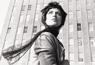
Monday, February 6, 2012

New Genres Projects

Project #1
My personal journey


We as a group decided that we wanted to do something that couldn’t be done here on campus. So from there we thought about the words on the project outline: time, space, and the human presence. It hit me and steph that a continuation of her senior seminar project fit those words all too perfectly. When Melissa saw her photos she agreed that it was perfect. We thought about what we could do as zombies that would bring to life the realization that we dwell on death all too much and that we as humans tend to do the same things day in and day out with conveying emotion. Then from there we decided on a location. A GROCERY STORE. From there we had to choose someone that could keep a straight face while getting quite close to a stranger and never breaking character. That was how I landed with the job. I knew that it was going to be hard to break out of my normal character and get as close as I could to a person in a situation in which you often don’t get supper close.
My first task in this group project was to a test run. I was kind of nervous to do this dressed as me and not as the soon to be “zombie marie.” However after I got to the store I discovered that it was not as hard to take on this persona of being in someone else's special bubble. It was most definitely uncomfortable and people were rather rude or looked at me like I was some complete moron. I ended up only doing a few people because I was way out of my comfort zone. After I left the store I was feeling pretty confident about my experience and was interested to see the difference in my experience as a zombie.
Our second task was to record how I felt while doing my test run. Which is where my partners learned of my personal experience and how I felt. They reassured me that I could do this. Then we sat down and thought about which store we were going to use. We couldn’t do Walmart because too many weird people go there that already violate your space and make you stop and stare. We finally decided on Foodlion.
Zombie time! Task Three was to turn me into the walking dead and head to the store. We had to make a pit stop at the doctor’s office for steph eye appointment. While there we decided that we should do a test run. We decided that it would be great because the people in the room had nothing to stare at or to distract themselves from me. This actually turned out to be more uncomfortable than the grocery store. Do in part that I too was trapped in this room. I felt more aware of the stares and how uncomfortable I was making the people I was sitting across from. From there we went to Foodlion. It was not quite enough people so after I did my thing we headed to Harris Teeter’s to do another run. This time we found lots of people for me to get close. We spent about 45 minutes at each store if not longer. We did not have a set time. It was just until I felt like I was done or we ran out of people.
Finally, task four. Put it all together. We then sat down and I did a testimonial on how I felt the second time through. Along with My testimonial Melissa and Steph also described how they felt during the process and what they saw.

Observation #1: People act out more around normal people than they do when you are dressed out of the normal or act in an un-normal manner. When I was dressed like I would on any other day people were not afraid to give me weird looks, ask me what I was doing, or just plain run away from me. But when I was dressed like a zombie and walked like one too people were polite. They moved out of the way, they said sorry and over all tried not to stare at me. I have decided that people do not want to act un-normal around un-normal people because it is considered rude, but if you act un-normal and look normal people are not afraid to be on guard. 

Observation #2: When you stop thinking about your self and start paying attention to the world around you, things come into the clear. My first run through I was to concentrated on how I was feeling and not as much on how others were acting around me. The first few people I stood next to were a blur, I was too consumed in my own inner thoughts. As i got my head straight I was more aware of how they acted. Then on round two I was barely thinking about how I felt and was more concentrated on my surroundings and how others were acting. It was definitely an eye opening experience.

Wednesday, January 18, 2012

New Genres

Blog Post 1

Well based on the power point that we saw in class the other day, I would have to say that the one that I responded to the most was Yoko Ono – Cut Piece - 1964. Part of the reason why I was drawn to this video was mostly because I know that this is something I could not do my self. I don't think I could let strangers come up and cut my clothes off. The other reason as to why I wouldn't be able to do is because of what happens when the guy cuts her bra off. She keeps her composure. I know that I would most likely say something to the man about how they were spose to cut the dress off, or refuse to let him cut it off. However to contradict myself there was no explanation of what they could or could not cut off of her. As the lady states it invites people to explore the boundaries, are there any or do we make boundaries for ourselves? It is piece where you can walk away with your own interpretations and feelings whether you were took part in cutting away her clothes or if you were just a spectator.

I did a little more research on this piece: 
1. Yoko Ono first performed ‘Cut Piece’ in 1964 in Japan. She repeated the performance at Carnegie Hall in New York in 1965. In September of 2003 she performed the piece for the last time in Paris. 
2. The piece ends when nothing more can be cut, or when the performer decides that the piece has ended. (The piece is non gender specific, meaning that the subject in which you cut clothing off of could be male or female.) 
3. Art historians and critics have descried it- “more like a rape than an art performance”. Yoko Ono lies still and quiet, her eyes fixed and distant as pieces of fabric are removed from her body… first someone takes a sliver at the neck, then someone tears at an arm, then a piece is cut at her belly…and so the piece proceeds, sometimes with long pauses until somebody grows bold and proceeds again. 

Blog Post 2:

This past week I would have to say that my favorite artist was Tony Orrico. I found his work incredible and inspiring. The first aspect of his work that really inspired me was his personal connection to his work. With out his understanding of math and how the body moves his art work would not turn out as it does. I appreciate the time he spent planing out the circles based on the 4 different mathematical shapes. For me the other aspect that really drew me into his art work was the combination of dance and art. Between his arms and legs and the almighty drawing tools we get this truly mind boggling art work. 

Not only is he and his art work one but it started out on his kitchen wall. In what most people consider the heart of the house he discovered that if not one hand was in control but rather they moved as one you could take your art work to a whole new level. It may be just me but I find it interesting that he started this drawing in his kitchen. A place where was as humans run to all the time but tend to also over look its importance. Now he could have just seen a white wall that he could practice his new found talent out on but I see it as a symbol.... he puts his heart and soul into his work... like I said before he was in the hearty of the house. 

Blog Post #3
  Earth art:  is an art movement which emerged in the United States in the late 1960s and early 1970s, in which landscape and the work of art are inextricably linked.


Most deffinitly true for  Christo and Jeanne-Claude. A husband wife duo that have worked side by side to create these monstrosity earth art works. I was familiar with a few of the pieces presented in class from a previous project I did in digital photography. However they were just a side note to my presentation. Apon hearing the presentation I was interested in doing some reserach on my own. A few things that I thought were interesting were:
How do they chose the locations?
Well sometimes they have a location in mind and other times they have an idea but no lactation. for the projects that they don't have a location they end up going on road trips to find the perfect space for their art work.   
Inspirations, where do they come from? 
“Projects come from ideas from their two hearts, and two brains. The artists never create works that come from other people's ideas. Never.
 Lastly.....
YOU CAN WORK ON THE ART WORK ALONG SIDE OTHERS! YES PLEASE! 
I found it interesting that they go on road trips to so many different locations to pick the right spot. Sounds like an extra bonus to me, travel, art work, get paid! However in their Over The River, Project for the Arkansas River, State of Colorado, they drove 14,000 miles in the Rocky Mountains and inspected 89 rivers in search of the river that would provide all the characteristics they were looking for. That is a lot of time and driving; I don’t think that I could do the driving part.  
I also found their works interesting because for most people they have no idea that they are about to walk on/drive through/or pass by the art work till they are there.  How awesome would that be on a family vacation, driving through the mountains when all of a sudden you are going under this bright orange fence! I think that there should be a lot more of these works throughout the US! It would make long rides more enjoyable and art educational!

Artist from the Book= Valie Export

Her artistic work includes video installations, body performances, expanded cinema, computer animations, photography, sculptures and publications covering contemporary arts.  The work I found most interesting form her is called "The Screening." To give you a better understanding of what it is I think her own quote will help: "The screening takes place in the dark as usual: except that the movie room has shrunk a little. It only has room for two hands. In order to to see the film, which in this case means to sense and feel it, the "spectator" has to put both their hands through the entrance of the movie house." Strapped to Export's bare torso is a curtained box. In 1968 offering her breast as the scene she created the TAPP-und TASTKINO ( TAP and TOUCH CINEMA). She referred to this as the first genuine women film. A film in which forced its audience to engage in an awkward experience of touching a strangers body while looking at her indifferent face.  The media responded to Export's provocative work with panic and fear, one newspaper aligning her to a witch. From 1969-1971 Export traveled throughout Europe, several of her performances provoked hostile reactions. She was banned from a preformance in Stuttgart because of a riot in which Export sustained a head injury.


Another one of her preformances I thought was interesting was Aktionshose: Genitalpanik (Action Pants: Genital Panic), Valie Export entered an art cinema in Munich, wearing crotchless pants, and walked around the audience with her exposed genitalia at face level. The performance at the art cinema and the photographs in 1969 were both aimed toward provoking thought about the passive role of women in cinema and confrontation of the private nature of sexuality with the public venues of her performances. Though this performance did need the audience to feel something every one in the room was a part of it.

Blog Post #5

Felix Gonzales-Torres was actually the one artist that really caught my eye in the book last week for the homework blog, but then I realized that he was going to be presented on in class. It is a win win, I still get the chance to talk about him. He is considered within his time to be a process artist due to the nature of his 'removable' installations by which the process is a key feature to the installation. I think that his work is amazing. I love how he takes something as simple as candy to make a statement and how personal it is to him and to what is going on in the world at the time.  I think that the part I found most interesting was his candy installations. The fact that each of them are a certain pound to represent something as significant as his partners weight when he was healthy. Then over time the viewer takes away the weight, just as the cancer took his partners weight. I also really like his paper stacks, In 1989 González-Torres presented Untitled (Memorial Day Weekend) and Untitled (Veterans Day Sale), exhibited together as Untitled (Monuments): block-like stacks of paper printed with content related to his private life, from which the viewer is invited to take a sheet. Rather than constituting a solid, immovable monument, the stacks can be dispersed, depleted, and renewed over time.
 I had not seen his light installations until they were presented in class. Which made me want to look them up and see what they were about. This is what I found: "The most pervasive reading of González-Torres's work takes the processes his works undergo (lightbulbs expiring, piles of candies dispersing, etc.) as metaphor for the process of dying. However, many have seen the works also representing the continuation of life with the possibility of regeneration (replacing bulbs, replenishing stacks or candies)." I think that it is interesting that his work can be so simple and yet so powerful in context. It really makes you stop and think about the things around you and what they could represent in the grand scheme of things. 


Blog Post#6  
                                                                                                                                               
This week I decided to write about Tim Hawkinson. I was really interested in his work in class and jelous that I have never seen his work. I would like to exsperience the rooms. I would probably spend way too much time in his exibits. I found that I was captivated right off the bat by the face peice, "Emoter." I found it interesting and a bit like surealism... in the way the face was morphed into new faces, un real but real. I also thought that his drawings, the ones where he used a drill to control how wide the circumference of the circles the pencil was making was interesting. I would have never thought about using a drill to do such a thing. I also found "Uberorgan" over the top intriguing. I don't think that I can say it any better than he does... "Several bus-size biomorphic balloons, each with its horn tuned to a different in the octave, make up a walk-in self-playing organ. A 200 foot-long scroll of dots and dashes encodes a musical score of old hymns, pop classics, and improvisional ditties. This score is deciphered by the organ's brain - a bank of light sensitive switches - and then reinterpreted by a series of switches and relays that translate the original patterns into non-repeating vairations of the score."

Blog Post #7                                                                                                                                               

In class I was intrigued by Sophie Calle. I love that she has the guts to do some of the things that were presented. I am not sure that all of us have in us to follow some one around that you don't know and to let them take you place, or lead you to new places. I think that it was an interesting concept though, to just follow some one, let them decided where your feet take you, and by following that person you can learn about them and study their routine.  The  other one of her pieces that I found interesting was the one in which she let others come sleep in her own bed. Strangers in the bed. Again I may never be able to do such a thing but I definitely find it interesting. I like how a lot of her work are about observations . I think that human observation is fascinating, I am not sure that it is always considered art, but at the same time the close encounter with others can inspire you in the most surprising ways.  I also wanted to talk about her address book piece. I love that she found it in the street and took it home and copied it and mailed it back to the person, little did that person know that she had photocopied it. Then she set about making a portrait of the man that she was falling in love with based on his information.

Monday, June 20, 2011

Art Nouveau

Alphonse Mucha
http://www.abcgallery.com/M/mucha/muchabio.html


He was a prolific Moravian painter of the late 19th and early 20th Centuries and a key figure in the Art Nouveau movement. His style of painting influenced an entire generation of painters, graphic artists, draughtsmen and designers and in the minds of many, his work epitomizes the Art Nouveau. He himself came to resent his fame as an artist of the utilitarian, believing that true art should be elevated and epic.
In 1892, the painter designed his first advertising poster. Finding this line of work profitable, he began taking regular commissions and, in 1894, he designed a poster for the show " Gismonda" of the highly popular stage actress Sarah Bernhardt. The poster was revolutionary, bringing unheard of innovations to the art of poster-printing, which had hitherto consisted of large amounts of text with a few simple illustrations, usually in just one or two colors. The Gismonda poster (1892) employed a radically new vertical format -- a legacy of which we can see in posters today -- and an unheard-of amount of colors and detail. Although the painter thought of his Art Nouveau work as scarcely more than a means of earning money to enable him to pursue more serious things, critics thought differently. In 1897, the painter had his first one-man exhibition at the Galerie La Bodiniere. Later that year, a second, much larger exhibition was held at the Salon de Cent, and proceeded to tour Europe.

I know I have already done an entry on him but I have really enjoyed finding more information about him. Plus I decided that if I was going to do a whole section dedicated to art nouveau that it wouldn't be right to not add him here again. I have been looking at a few of his images and getting ideas for what I might possibly be able to use for my own projects. I really like all the patterns and all the small details that make up one poster.

Victor Horta
http://www.senses-artnouveau.com/biography.php?artist=HOR


Victor Horta was one of the leading architect and designer of Art Nouveau and his style inspired many modernist artists all over Europe. He also influenced the aesthetic ideals the avant-garde group of artists in Belgium, such as "Les Vingt" and "La Libre Esthétique". After studying drawing, textiles and architecture at the Fine Arts Academy in Gent, he established his own practice in Brussels and in 1893 he built the first Art Nouveau building, Tassel House. In the late 1890s, he was commissioned by the Belgian Socialist movement to build the Maison du Peuple. In 1898, he built his own house and workshop, now the famous Horta Museum. Inspired by nature, his style was swirling and linear, like the stems of plants. Tending towards unity, every material, surface, ornament, inside or outside, was harmoniously assembled with great fluidity and highly detailed by innovative shapes and lines. The houses are especially significant for their interior architecture: the irregularly shaped rooms open freely onto one another at different levels; the natural design of an iron balustrade is echoed in the curving decorative motifs of the mosaic floors or plaster walls.

I really like the fact that art nouveau is not just about posters, but can be seen every where you look. I didn't even think about the fact that there are a lot buildings that can be categorized in this movement. After I looked at some of the buildings that he inspired I noticed that I am drawn to them. In fact some of my furniture in my room looks like it has been inspired by such things as his door knob above. I guess its true that you cant help but to be drawn to the things that you like.


Louis Comfort Tiffany
http://www.senses-artnouveau.com/biography.php?artist=TIF


1882 he began designing glasswork of remarkable beauty in typical Art Nouveau Style. In 1902, he became art director of his father's legendary company, Tiffany & Co. in New York. He designed for the firm colored glass table lamps and lampshades, which were made in more than one edition. It was Thomas Edison who urged him to focus on electric light production after their collaboration on the design of the first Moving Picture Theater. Tiffany also designed and produced glass vases, tiles, mosaics and stained-glass-windows. In 1895, his glassware was exhibited in Samuel Bing's Gallery "L'Art Nouveau" in Paris. Tiffany wanted to elevate decorative arts to the level of fine arts, available to a wide audience. His work was influenced by Japanese and Northern-Africa aesthetics and colors; the pieces he produced between the 1890s and 1918 were magnificent, exotic and of the highest quality. His unique style became a driving force behind the emergent Art Nouveau Style. His jewel-like Tiffany lamps feature decorations inspired by organic naturalistic themes, such as flowers, butterflies or dragonflies amongst foliage. The shades are made in multi-colored, iridescent glass, set in leaded framework and their beautifully crafted bronze bases, are often decorated by tree-like motifs, or by incorporated tilework or mosaic work.

I had never thought about Tiffany lamps as part of the movement. However after looking up the lamps and stain glass panes that they use to make it is clear that they were very much apart of the movement. What I think is cool is that he made the art not just something that you hung up on your walls but something that became apart of every day life, such as a table lamp. The other part of these lamps and jewels that just makes it all more fascinating is the fact that they are so widely known and I don't know anyone that doesn't like them.

Margaret Macdonald
http://www.antique-marks.com/art-nouveau-artists.html

 Margaret and her sister, Frances MacDonald, enrolled as students at the Glasgow School of Art. There she worked in a variety of media, including metalwork, embroiery, and textiles. She was first a collaborator with her sister, and later with her husband, thearchitect and designerCharles Rennie Mackintosh. Together with Mackintosh, her sister, Frances, and Charles's friend Herbert MacNair (who married Frances in 1899), formed the group known as 'The Four', who worked in close association and were pioneers of the so-called Glasgow Style. Her watercolours were influential in Mackintosh's own creative development, and she collaborated with him on many of his decorative and architectural projects. After her marriage Margaret Macdonald's work changed and she began to concentrate on decorative gesso panels.

Though I am not as big of a fan of her work I can see how she can be categorized in the art nouveau movement. I think that she was more concentrated on the line movement of the style and the fluid movement of the nature that is present in other works. The one part that I didn't like was that she didn't have as much detail and the figures were not as pronounced or detailed.


Jules Cheret
http://www.visual-arts-cork.com/famous-artists/jules-cheret.htm


He was the first artist to make his reputation in the medium of poster art. An apprentice lithographer who went on to develop a cheaper type of colour lithography and, in the process, the lithographic advertising poster. Moreover, he enhanced the aesthetic nature of the poster, endowing it with graceful designs and transforming it into an independent decorative art form. Known as the "father of the Belle Epoque poster", he inspired other painters to explore the genre, and later produced a special book entitled Masters of the Poster, to promote the best designers. A key figure in the history of poster art, Cheret produced more than 1,000 posters, beginning with his 1867 advertisement for Sarah Bernardt, and in 1889 he received a major solo exhibition and a gold medal at the International Exhibition in Paris. He was awarded the Legion d'Honneur in 1890, and in 1928 the French government honoured his achievements in graphic art with the opening of the Cheret Museum in Nice.

It was easy to see that he was producing posters during the art nouveau movement. I would defiantly say that it is a bit more modern than the above artist. I can see why he would have a major influence in poster art though. The above image defiantly looks like something that would catch your eye and draw you in. Which is good specially if you are trying to sell some product.

Gustave Klimt


Gustav Klimt was an Austrian Symbolist painter and one of the most prominent members of the Vienna Secession movement. Klimt's primary subject was the female body, whether formal portraits or indolent nudes invariably display highly sensitized eroticism of the fin de siècle elegance. Art historians note an eclectic range of influences contributing to Klimt's distinct style, including Egyptian, Minoan, Classical Greek, and Byzantine inspirations. Gustav was enrolled, at 14, in the Vienna School of Arts and Crafts, and received training as an architectural decorator. Hebegan his professional career painting interior murals in large public buildings on the Ringstraße. In 1888 he received the Golden order of Merit from Emperor Franz Josef I of Austria for his contributions to art. He also became an honorary member of the University of Munich and the University of Vienna. Gustav Klimt's style is highly ornamental. The Art Nouveau movement favored organic lines and contours. Klimt used a lot of gold and silver colors in his art work - certainly an heritage from his father's profession as a gold and silver engraver.

What I liked most is the fact that his work has a photo quality to it. However I am not as much of a fan of his style in the background, you can clearly see that he is looking at nature for his inspiration like other but he has simplified it and has not made it realistic. Some of his stuff is a little more on the dark side, like the above image. The woman appears to be holding a male head. Did she kill him? I think what would have made it feel more art nouveau to me is if it had some borders and maybe some more pattern or nature like movement to them. However this is the difference in the areas that they were done. The images will be different when they are being done in different parts of the world.

Daniela Uhlig

I could not find any information about this graphic designer other than the fact that she works for a small company doing designs and illustrations. However when you view her website she has a wide range of image to look at. I really like her stuff, you can tell that some of them she was looking at someones work and others she has her own style to them. The above image is one in which I really like since I am thinking of doing something similar to her work. I think she did a good job of capturing the movement of the figure and then adding a background that has some pattern and nice detail. I also love the border and the circle. I hope that I can get my work to come out looking like this. 


Eden Celeste
http://www.edenceleste.com/

She has painted portraits ever since she could get a brush in her hands. For most of her career her art has focused on fantasy and sci-fi , but within the last decade she has grown to discover that er real talent and desire is in portrait art. She has a broad range of portrait interests, from the traditional style of the old masters to more of a whimisical mixture of traditional and fantasy art. For the most part she has focused on the human form, but recently she discovered that some objects also have a personality and interest as well.
Her latest series, which she calls "Artist's Cellar" is based upon her love of good wines. Each one uses a mixture of mediums including canvas or box laminated with multi-colored paper and a bottle of a favorite wine and glass painted upon it. They are sized mostly at 8"x16", which she has found to be a perfect size to display in a kitchen, dining rom or other household spot where you would typically enjoy a nice glass of vino.

There was not much info on this artist but again I can tell that she has looked at the style. However she says that she loves wines, I would have exspected there to be a lot more vine work and maybe some more stylized movement around the figure.

Toulouse Lautrec
http://www.ibiblio.org/wm/paint/auth/toulouse-lautrec/
http://www.notablebiographies.com/St-Tr/Toulouse-Lautrec-Henri-de.html


In 1882, encouraged by his first teachers—the animal painters René Princeteau and John Lewis Brown—Toulouse-Lautrec decided to devote himself to painting, and that year he left for Paris. Enrolling at the École des Beaux-Arts, he entered the studio of Fernand Cormon. In 1884 Toulouse-Lautrec settled in Montmartre, an area in north Paris, where he stayed from then on, except for short visits to Spain,
where he admired the works of El Greco (1541–1614) and Diego Velázquez (1599–1660). In England he visited celebrated writer Oscar Wilde (1854–1900) and painter James McNeill Whistler (1834–1903). At one point Toulouse-Lautrec lived near painter Edgar Degas (1834–1917), whom he valued above all other contemporary artists (artists from his time) and by whom he was influenced. From 1887 his studio was on the rue Caulaincourt next to the Goupil printshop, where he could see examples of the Japanese prints of which he was so fond. The two most direct influences on Toulouse-Lautrec's art were the Japanese print, as seen in his slanted angles and flattened forms, and Degas, from whom he derived the tilted perspective, cutting of figures, and use of a railing to separate the spectator from the painted scene, as in At the Moulin Rouge. But the genuine feel of a world of wickedness and the harsh, artificial colors used to create it were Toulouse-Lautrec's own. Toulouse-Lautrec broadened the range of lithography (the process of printing on metal) by treating the tone more freely. His strokes became more summary (executed quickly) and the planes more unified. Sometimes the ink was speckled on the surface to bring about a great textural richness. In his posters he combined flat images (again the influence of the Japanese print) with type. He realized that if the posters were to be successful their message had to make an immediate and forceful impact on the passerby. He designed them with that in mind. Toulouse-Lautrec's posters of the 1890s established him as the father of the modern large-scale poster. His best posters were those advertising the appearance of various performers at the Montmartre cabarets, such as the singer May Belfort, the female clown Cha-U-Kao, and Loïe Fuller of the Folies-Bergère.
I really like dhis work. I thought that his poster style was really insperational. I think that he helped to lay some of the ground work for what we see today. I also can see why they said that he did such a wonderful job at advertising, like the above poster. That poster does a great job of showing what the club was about and what one was likely to feel while there. I think that you can also see in the above poster that he was doing the quick strokes. The figures are not exact but you can get a sense of the movement. I also think that the quick drwing helps to give the posters viwers that at easy feeling of what is to come as they enter through the doors. I am not sure that I see to much of the japanese influence in this one. None the less I was really drawn to this image.


Louis Majorelle
http://www.antique-marks.com/louis-majorelle.html


He was one of the outstanding designers of furniture in the Art Nouveau style, and after 1901 formally served as one of the vice-presidents of the École de Nancy. In the 1880s Majorelle turned out pastiches of Louis XV furniture styles, which he exhibited in 1894 at the Exposition d'Art Décoratif et Industriel in Nancy, but the influence of the glass and furniture maker Emile Galle inspired him to take his production in new directions.  In the 1890s, Majorelle's furniture, embellished with inlays, took their inspiration from nature: stems of plants, waterlily leaves, tendrils, dragonflies. Before 1900 he added a metalworking atelier to his workshops, to produce drawerpulls and mounts in keeping with the fluid lines of his woodwork. His studio was responsible for the ironwork of balconies, staircase railings, and exterior details on many buildings in Nancy at the turn of the twentieth century. Often collaborating on lamp designs with the Daum Frères glassworks of Nancy, he helped make the city one of the European centers of Art Nouveau. 

I can see in the above vase the style represented nicely. There are a lot of poster by Mucha that have the same line work that break up the peice. Which he has done here with metal work. I like that he kept it simple and symetrical. The vase can be bent in half vertical and you would get the same pattern on both sides. I also like that the glass has some dark spots on it. It reminds me of some of the backgrounds in the posters and paintings.

William H. Bradley
http://www.willbradley.com/biography/


William Henry Bradley was largely self-taught as an artist. He began working in a printer's shop at the age of twelve in Ishpeming, Michigan, where his mother had moved in 1874 after the death of his father. His work at the print shop would be important in introducing him to the many issues of typesetting, advertisements, and layout that would occupy him in the years to come. Bradley executed a number of designs to promote The Chap-Book, a short-lived but important publication based in Chicago. His 1894 design for Chap-Book, titled The Twins, has been called the first American Art Nouveau poster; this and other posters for the magazine brought him widespread recognition and popularity. In 1895 Bradley founded the Wayside Press in Springfield, Massachusetts, and published a monthly arts periodical, Bradley: His Book. He remained an active and important member of the graphic arts world for the rest of his long life. Bradley was well acquainted with the stylistic innovations of his European counterparts. Like many French artists, he borrowed stylistic elements from Japanese prints, working in flat, broad color planes and cropped forms. He appropriated the whiplash curves of the Art Nouveau movement so dominant in Europe at the turn of the century and was influenced by the work of the English illustrator Aubrey Beardsley. In 1954, Bradley was awarded a gold medal by the American Institute of Graphic Arts.


I think one of the things that really makes me stop and look is the fact that he uses a limited color scheme on his designs. There is not a lot of different colors to distract you and the colors all seems to be kind of dull and dark. However the colors that he uses deffinatly draw you in. Like the above image. He uses the red and black. These two colors are so strong. They can sometimes fight one another but here they work nicely to move ones eye around the page. What I also like about having only two colors is the fact that it balances out the image nicely.

Tuesday, June 14, 2011

Photography


Diane Arbus
http://www.photogs.com/bwworld/50masterphotogs.html
http://www.americansuburbx.com/2009/01/theory-where-diane-arbus-went.html


She learned a great deal of her photography skills from her parents. In the 1940's her parents decided to open a commercial photography business. Diane as art director and her father the photographer. They did mainly fashion  photography though they both hated it. In 1956 she quit her family's business,  She began photographing on assignment for magazines such as Esquire, Harper’s Bazaar, and The Sunday Times in 1959.Approximately 1962, Arbus switched from a 35mm Nikon camera which produced grainy rectangular images to a twin -lens reflex Rolleiflex camera which produced more detailed square images. She has been noted for those black and white square photographs of "deviant and marginal people or of people whose normality seems ugly or surreal." A friend said that Arbus said that she was "afraid... that she would be known simply as 'the photographer of freaks." However, that phrase has been used repeatedly to describe her.

The first thing that really made me stop and look at her work was the fact that she used a sq format. You don't see many people that do that now a days. With doing digital most people just stick to the format that we are use to seeing, rectangle. I also thought that it was interesting that she quit her family business to do her own thing however to me it seems like her work still had a magazine look to it. The above image was done on her own and though it is of a circus performer I can see this being featured in a magazine revolving around tattoos.


Richard Avedon
http://www.designboom.com/history/avedon.html


 In 1940, at age 17, Avedon dropped out of highschool and joined the merchant marine's photographic section, taking personnel identification photos. Later, he went on several missions to photograph shipwrecks. Upon his return in 1944, he found a job as a photographer in a department store. Initially, Avedon made his living primarily through in advertising. As a staff photographer for Harper's Bazaar and later for Vogue, Avedon became well know for his stylistically innovative fashion work, often set in a vivid and surprising locales. Although Avedon first earned his reputation as a fashion photographer, his greatest achievement has been his reinvention of the genre of photographic portraiture. His ability to express the essence of his subject. Avedon’s pictures continue to bring us a closer, more intimate view of the great and the famous. The portraits are often well lit and in front of white backdrops, with no props or extraneous details to distract from their person - from the essential specificity of face, gaze, dress, and gesture. when printed, the images regularly contain the dark outline of the film in which the image was framed.

I really enjoyed looking at his work. One of the things that I found most interesting was the fact that he left the black outline of the film strip round the images. Most people blow the image up so that you crop off those areas. I think that it helps to add something more to the photos. It is kind of like he is trying to put them in a box or even to single the subjects out even more. The next thing that made me stop and look at his work was the fact that he captures all his subjects with no emotion in the faces, they all seem to be just there. Which kind of goes with the black box around them, as though they are trapped and have been there for too long and are void of emotion.

Phil Borges
http://www.philborges.com/bio.html


For over twenty five years Phil Borges has lived with and documented indigenous and tribal cultures around the world. Through his work, he strives to create a heightened understanding of the issues faced by people in the developing world. Phil attempts to create a relationship between the audience and his photographic subjects. “I want the viewer to see these people as individuals, to know their names and a bit of their history, not just to view them as an anonymous part of some remote ethnic or tribal group.” In 2004 Phil began an ongoing project to highlight the oppression and discrimination women and girls still face in the developing world.  Phil worked with the organization CARE to release the book and exhibition titled Women Empowered in 2006. Phil has hosted three television documentaries for Discovery and National Geographic as a part of a series that investigates indigenous cultures that still maintain a spiritual dialogue with the natural world.

I really enjoyed the images that he has in each of the different galleries. I think my favorite is the one with the women, i feel that he did a great job of showing them strong and a glimps of who they are and what they have to deal with every day! The other part that pulled me into these images was the eyes, he did a good job of getting you captivated as a viewer in their eyes. They pull you in and hold you there, as if they are speaking to you.

Cindy Sherman
http://www.cindysherman.com/biography.shtml


The majority of her photographs are pictures of her, however, these photographs are most definitely not self-portraits. Rather, Sherman uses herself as a vehicle for commentary on a variety of issues of the modern world: the role of the woman, the role of the artist and many more. It is through these ambiguous and eclectic photographs that Sherman has developed a distinct signature style. Through a number of different series of works, Sherman has raised challenging and important questions about the role and representation of women in society, the media and the nature of the creation of art. In these photographs, begun in 1977, Sherman places herself in the roles of B-movie actresses. Her photographs show her dressed up in wigs, hats, dresses, clothes unlike her own, playing the roles of characters. While many may mistake these photographs for self-portraits, these photographs only play with elements of self-portraiture and are really something quite different. In each of these photographs, Sherman plays a type -- not an actual person, but a self-fabricated fictional one. There is the archetypal housewife, the prostitute, the woman in distress, the woman in tears, the dancer, the actress, and the malleable, chameleon-like Sherman plays all of these characters.
Sherman's second most known body of work came some time after the Film Stills had already been well received, around 1988-1990. In the History Portraits Sherman again uses herself as model, though this time she casts herself in roles from archetypally famous paintings. While very few specific paintings are actually referenced, one still feels a familiarity of form between Sherman's work and works by great masters. Using prosthetic body parts to augment her own body, Sherman recreates great pieces of art and thus manipulates her role as a contemporary artist working in the twentieth-century. Sherman lived abroad during this time in her life, and even though museums would appear to be the source of inspiration for this series, she is not a fan of museums: "Even when I was doing those history pictures, I was living in Rome but never went to the churches and museums there. I worked out of books, with reproductions. It's an aspect of photograph I appreciate, conceptually: the idea that images can be reproduced and seen anytime, anywhere, by anyone."

One of my fellow classmates did a presentation on her in one of my other art classes. Therefore I was already aware of her style and what she was most known for. However I hadn't the chance to know her as much as I did through her bio on her page. I also was gravitated towards her because I have often thought of doing whole projects where I take on different types of people. Mainly because it is kind of cool to study the people that you are looking to become and try to make the image portray who they truly are. A good example would be to do a lot of research on influential women in history and do several scenes where you portray them. I think that doing images of your self also takes a lot of patience because you cant see through the lens, so you really have to have an image in your head and take it over and over until you get what you are looking for.

Minor White
http://www.vasculata.com/minor_white.htm


Minor White (1908-76) was one of the greatest American photographers of the period after the Second World War as well as one of the greatest teachers of the medium. One of the best-known names in photography until the end of the 1970s. White was a deeply religious man whose whole life was a spiritual journey. His photography arose out of this and was an inherent part of this pilgrimage. It isn't an approach that has been fashionable in academic circles in recent years.  He bought a 35mm Argus camera and with a few dollars in his pocket set off for the West coast. At Portland, Oregon he found a job as a night clerk in a hotel, which allowed him to photograph during the day.While in Portland he joined the Oregon Camera Club and there he learnd more about photographic techniques, especially printing. For the only time in his life he also became involved in politics, acting as a brief spell as secretary of the 'People's Power League'. This led to his being offered work as a photographer by the Works Progress Administration (WPA), a federal 'New Deal' project set up to provide work for the unemployed.


I really enjoyed reading about Minor White. I had never heard of hime but think that his work is pretty good. The above image is 'Front Street, Portland, Oregon, 1939'. which was one the he did for WPA. I really liked the viewpoint of this photograph, I think that it is cool to see it done from a high view point. A lot of the ones that I have seen are done from the ground looking up where it distorts the buildings. I also liked how the light was coming in on this setting. It gives the road and the building to the left great detail from a cross light from the sun. Looking at some of his other work i=I would say that he understood lighting and how to use it. His lighting really brings the images to life.


Joel-Peter Witkin
http://www.davidknipper.com/famous_person/biography.htm


Joel-Peter Witkin is a photographer whose images of the human condition are undeniably powerful. For more than twenty years he has pursued his interest in spirituality and how it impacts the physical world in which we exist. His constant reference to paintings from art history, including the works of Bosch, Goya, Velasquez, Miro, Botticelli and Picasso are testaments to his need to create a new history for himself. By using imagery and symbols from the past, Witkin celebrates our history while constantly redefining its present day context. Witkin begins each image by sketching his ideas on paper, perfecting every detail by arranging the scene before he gets into the studio to stage his elaborate tableaus. Once photographed, Witkin spends hours in the darkroom, scratching and piercing his negatives, transforming them into images that look made rather than taken. Through printing, Witkin reinterprets his original idea in a final act of adoration.

I liked the fact that he use history and other artist to create his works. I chose the above image because I thought that this one looked like it was inspired by Botticelli's Birth of Venus. I might be just seeing that knowing that it was one of the images that he would have been looking at. However when you look at her stance and the cloth you can see resemblance to Botticelli's. I found the fact that he manipulates the negative with scratches and piercing. It is something that I haven't heard of doing, usually if your negative has a flaw in it, the image isn't always what makes you happy. His changes really add to them though.


Will Pearson
http://www.willpearson.co.uk/about.php


A professional panoramic photographer living in London and working worldwide. His panoramic photography and virtual tours have been showcased in the press, and the panoramas have been exhibited in various spaces in both the UK and China. He is frequently commissioned to take panoramic photographs to be reproduced at large-scale. A recent commission was reproduced at 32m (105 foot) long. Will has always tried to push the medium further. Browsing through his panoramic portfolio you will find fashion model ensembles, reportage shots of the anti-war demonstrations in London, shots inside burned out caravans in the desert, opera houses and offshore wind farms. His London skyline series of panoramas give viewers a new perspective on the capital from above.

It is incredible how detailed his panoramic images are. Alot of the time there is that atmospheric haze going on in the image that makes them kind of dueled out. I also was intrigued by the size that he can print his images at. As I will be taking the large scale printing in the spring I thought it was cool to see someone else doing large scale. The other part that I really liked was the fact that his images are just so striking. They make the viewer want to be where the image was taken. Some of the appeal to me is the skys and that there is usually verry little activity going on, they make hectick places look nice and peaceful.

Edward Steichen
http://www.spartacus.schoolnet.co.uk/USAPsteichen.htm


At the age of fifteen Steichen began a lithography apprenticeship with the American Fine Art Company in Milwaukee. He also attended lectures by Richard Lorenz and Robert Schode at Milwaukee's Arts Student s League. Steichen took up photography in 1895 but continued to paint for the next twenty years. Steichen began experimenting with colour photography in 1904 and was one of the first people in the United States to use the Lumiere Autochrome process. He travelled to Europe and collected the work of the best photographers and these were exhibited by AlfredStieglitz in 1910 at the International Exhibition of Pictorial Photography. Thirty-one of Steichen's photographs also appeared in the exhibition. During the First World War Steichen became commander of the photographic division of the American Exepditionary Forces. This gave him the opportunity to become involved with aerial photography. Shocked by what he witnessed on the Western Front, Steichen denounced impressionistic photography and instead concentrated on realism. He later wrote: "I am no longer concerned with photography as an art form. I believe it is potentially the best medium for explaining man to himself and his fellow man." After the war Steichen became increasingly involved in commercial photography. He worked for the J. Walter Thompson Advertising Agency and in 1923 became chief photographer for Conde Nast Publications and his work appeared regularly in Vogue and Vanity Fair.

I really like the above quote. I think that it is true that you can show man what the world is really like through photography. When you are taking images of war, or true destruction, you get an image that you just cant make up. I also think that photography can be verry powerful in the fact that it can show many people the reality of a situation.

Tim Walker
http://www.timwalkerphotography.com/


Born in England in 1970, his interest in photography began at Conde Nast library in London where he worked on the Cecil Beaton archive for a years work experience prior to University. After graduation he was a freelance photography assistant in London before moving to New York City as a full time assistant to Richard Avedon. Then he returned to England and concentrated on portrait and documentary work for UK newspapers. At age 25 he shot his first fashion story for Vogue. In 2008 his first major show was held at the Design Museum in London, which coincided with the publication of his first book.

I enjoyed flipping through his images. There was a number of them that made me feel like I had stepped into a new space or alternate world. He has a lot where he puts a bunch of randome colorful balloons. Taking something standard and adding a dash of childhood fun really changes the image. I chose the above image because I think that it is interesting.  To me it as though the dresses are alive, or haunting. I also feel that you can tell that he spent a lot of time developing his own individual style.


Brassai
http://www.atgetphotography.com/The-Photographers/BRASSAI.html


Brassai took his name from the town of his birth, Brasso, in Transylvania, then part of Hungary, later of Roumania, and famous as the home of Court Dracula. He studied art at the academies of Budapest and Berlin before coming to Paris in the mid-twenties. He was completely disinterested in photography, if not scornful of it, until he saw the work being done by his acquaintance Andre Kertesz, which inspired him to take up the medium himself. In the early thirties he set about photographing the night of Paris, especially at its more colorful and more disreputable levels. The results this project --- a fascinatingly tawdry collection of prostitutes, pimps, madams, transvestites, apaches, and assorted cold-eyed pleasure-seekers --- was published in 1933 as Paris de Nuit, one of the most remarkable of all photographic books. Making photographs in the dark bistros and darker streets presented a difficult technical problem. BRASSAI"s solution was direct, primitive, and perfect. He focused his small plate camera on a tripod, opened the shutter when ready, and fired a flashbulb. If the quality of his light did not match that of the places where he worked, it was, for BRASSAI, better: straighter, more merciless, more descriptive of fact, and more in keeping with BRASSAI's own vision, which was as straightforward as a hammer.

I really enjoyed looking through his different images. The ones that have people in them are interesting. He has some that appear as though he is capturing an intimate moment between the subjects, and others show them doing every day things such as sitting and eating, then you have the more scandals ones where the couple is doing something that in the bedroom that you don't see every day, a private moment. I really like his night scenes of just the buildings or streets. They are just stunning. I love the way he captures the lights. It makes a deserted street just simply come alive.